By: Belinda McGann, NATA’s Chief People Officer
At NATA, transformation doesn’t just happen overnight. It’s a slow, purposeful dance between reflection and reinvention — one that brings together hearts, minds, and meaningful design.
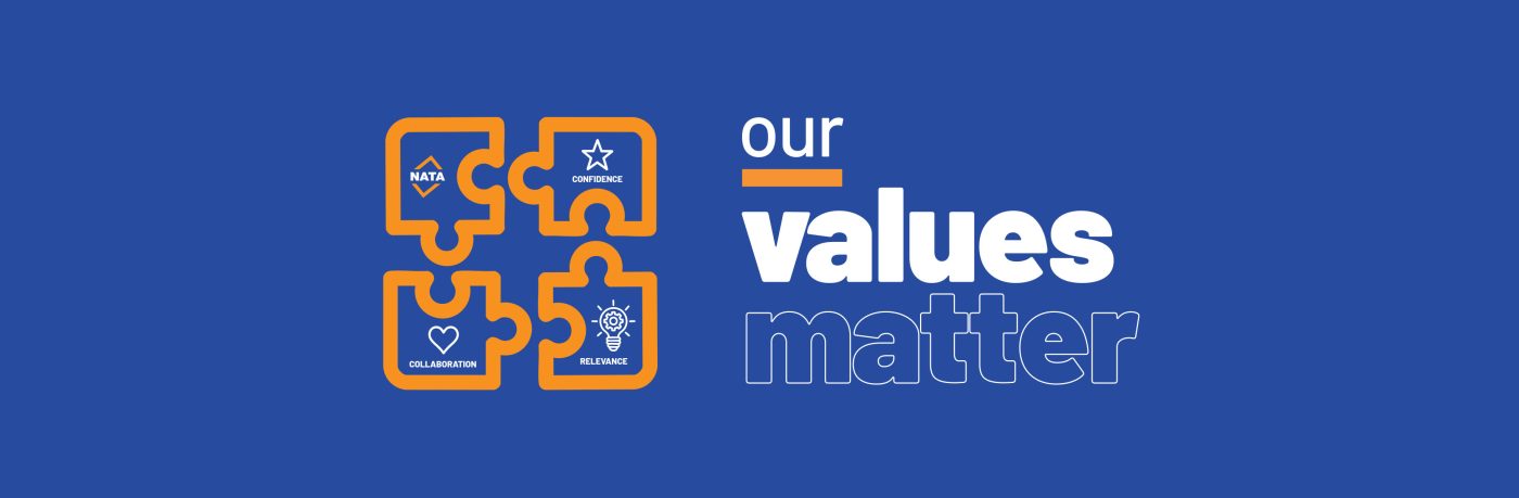
Today, I’m proud to share the result of that thoughtful evolution: our refreshed company values — Confidence, Collaboration, and Relevance — brought to life not only through language, but through new visual icons that embody who we are and what we stand for.
These values are more than just guiding principles. They’re the rhythm of our culture, the glue in our partnerships, and the beacon that guides our work across Australia’s technical and scientific landscape. But they didn’t appear fully formed. Like a puzzle, they were shaped piece by piece — by insight, collaboration, creativity, and intent.
A Metaphor Made Visual: The Puzzle Iconography
When we began this journey of renewal, we knew our values needed to feel lived, not just listed. And so, our design development process set out to build meaning visually — something that could echo the layered thinking behind these words.
The result? A set of values shaped by our people, for our future represented by an interconnected icon system anchored in the idea of a puzzle.
Each icon represents one of our core values, but not in isolation. Like the values themselves, they fit within a broader structure — nuanced and interlocking, forming a whole that only makes sense when all the pieces come together. It was a meticulous, collaborative process — and one that, fittingly, mirrored the very values we were defining.
Confidence
This value speaks to our foundation — built on trust, integrity, and capability. It’s the steady hand, the deep breath, the informed action. In our visual, this is symbolised with a strong, centred icon — conveying structure and clarity. It represents the assurance we give to our stakeholders, the belief our teams carry, and the legacy we protect.
Collaboration
Our work has always been a shared endeavour. Whether internally or externally, we move forward by connecting perspectives and working side by side. The icon for Collaboration features overlapping lines and mirrored shapes — a nod to open dialogue, reciprocal trust, and co-creation. It’s about building bridges, not silos.
Relevance
We exist in a world that is constantly shifting. Policy, technology, expectations — everything is in motion. Relevance, to us, means keeping pace with that change. It’s about being curious, responsive, and courageous. Visually, this icon radiates outward — signalling adaptability, innovation, and a future-ready mindset.
Values in Action
These values are already at work across our organisation — in the way our teams support each other, in how we listen and respond to our members, and in how we pursue excellence in every accreditation we deliver. They inform our culture and our strategy, from boardroom discussions to community outreach.
What’s most rewarding is that this refresh doesn’t erase who we’ve been. Rather, it affirms who we are becoming — a reflection of our commitment to evolve, thoughtfully and together.